Sobre o Jobhub:
O JobHub é uma plataforma desenvolvida como projeto de conclusão de um curso de UX/UI Design. Seu objetivo é oferecer um espaço acessível e justo onde freelancers criativos possam conectar-se com clientes de maneira simples e direta. Diferente das plataformas tradicionais, o JobHub evita processos complicados e problemas com bots, promovendo um ambiente que valoriza todos os usuários, independentemente de planos pagos.
About JobHub:
JobHub is a platform developed as a final project for a UX/UI Design course. Its goal is to provide an accessible and fair space where creative freelancers can connect with clients in a simple and direct way. Unlike traditional platforms, JobHub avoids complicated processes and issues with bots, fostering an environment that values all users equally, regardless of paid plans.
O Briefing:
Com o propósito de conectar freelancers criativos a seus clientes de forma justa, descomplicada e segura, o objetivo era desenvolver um logotipo e uma identidade visual que transmitissem um ambiente criativo e acolhedor. A identidade precisava ressoar com os profissionais que utilizam a plataforma e comunicar aos clientes que ali encontrariam talentos criativos e qualificados.
Briefing:
With the purpose of connecting creative freelancers to their clients in a fair, straightforward, and secure way, the goal was to develop a logo and visual identity that would convey a creative and welcoming environment. The identity needed to resonate with the professionals using the platform and communicate to clients that they would find skilled and creative talents here.
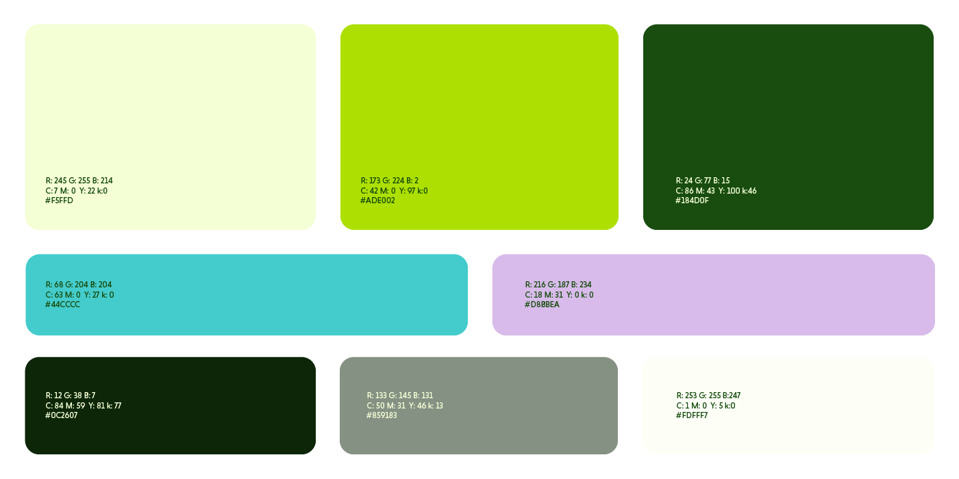
Paleta de cores:
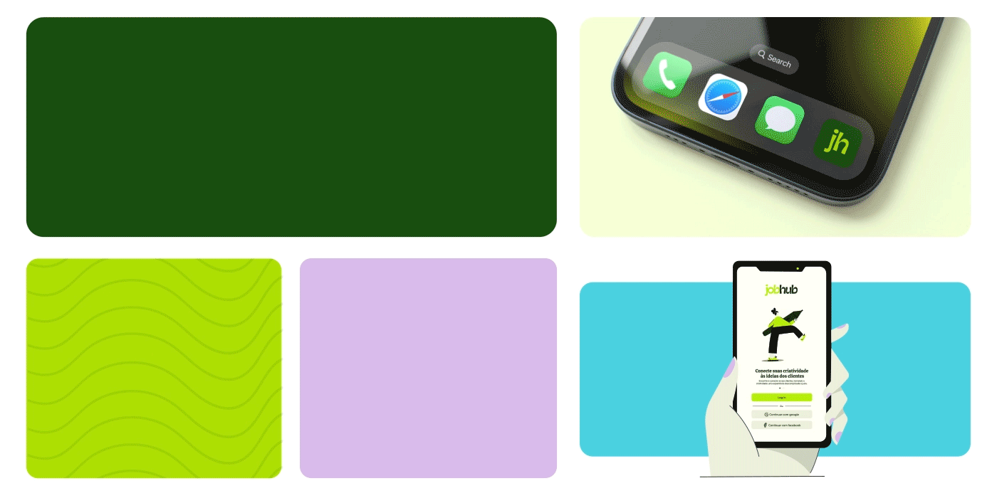
Para a paleta de cores, escolhemos tons alegres e vibrantes, com dois verdes como cores prioritárias da marca, transmitindo criatividade. Como cores secundárias e de apoio, optamos por tons de azul e roxo: o azul traz leveza para a paleta, enquanto o roxo se relaciona bem com o universo da tecnologia.
Color Palette:
For the color palette, we chose bright and vibrant tones, with two shades of green as the brand's primary colors, conveying creativity. For secondary and supporting colors, we selected shades of blue and purple: the blue adds lightness to the palette, while the purple aligns well with the tech world.
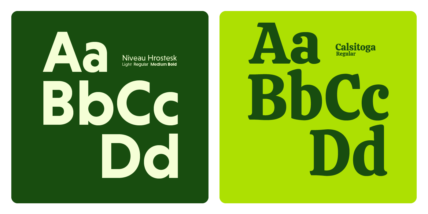
Tipografia:
Na tipografia, buscamos um equilíbrio entre criatividade e modernidade. Para os títulos, escolhemos uma fonte serifada e detalhada que transmite um toque de criatividade e contemporaneidade. Já para o corpo de texto, optamos por uma fonte sem serifa e moderna, que facilita a leitura e proporciona fluidez.
Typography:
In our typography, we sought a balance between creativity and modernity. For headings, we chose a serifed, detailed font that conveys a touch of creativity and contemporaneity. For the body text, we opted for a sans-serif, modern font that enhances readability and provides a smooth flow.
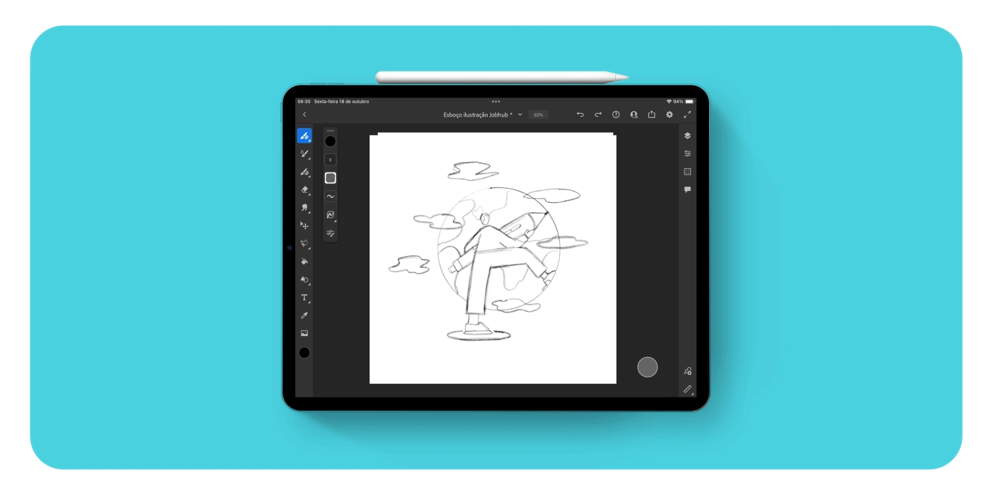
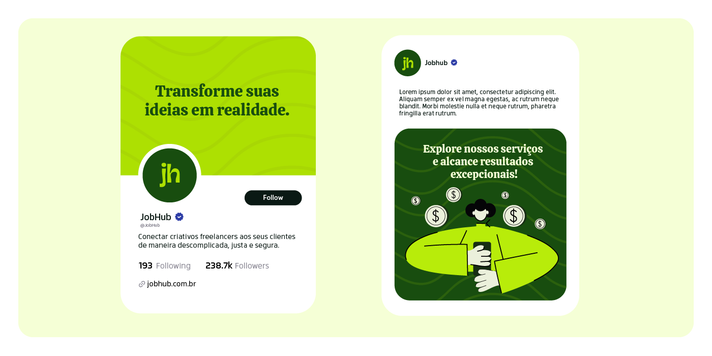
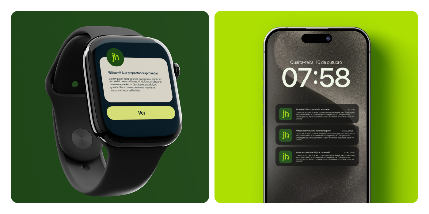
Ilustrações:
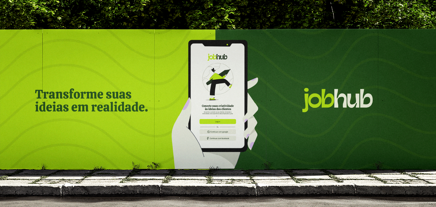
A ilustração é um dos principais elementos da identidade visual. Criamos ilustrações flat simples com a intenção de tornar não apenas a plataforma mais criativa, mas toda a comunicação também. A ideia é que as ilustrações se conectem tanto com os freelancers criativos quanto com os clientes da plataforma. Por isso, ao nos dirigirmos aos freelancers, utilizamos ilustrações em um tom de verde mais claro, que remete à criatividade. Já ao nos comunicarmos com os clientes, optamos por um tom de verde mais escuro, transmitindo seriedade e confiança.
Illustrations:
Illustration is one of the key elements of the visual identity. We created simple flat illustrations with the intention of making not only the platform more creative but also the entire communication. The idea is for the illustrations to connect with both creative freelancers and the clients on the platform. Therefore, when addressing freelancers, we use illustrations in a lighter shade of green, which evokes creativity. In contrast, when communicating with clients, we opt for a darker shade of green, conveying seriousness and trust.